Introduction
Is there life after the the template?
Perhaps the most persistent impulse of twentieth-century art and design was to physically integrate form and content. The Dada and Futurist poets, for example, used typography to create texts whose content was inextricable from the concrete layout of specific letterforms on a page. In the twenty-first century, form and content are being pulled back apart. Style sheets, for example, compel designers to think globally and systematically instead of focusing on the fixed construction of a particular surface. This way of thinking allows content to be reformatted for different devices or users, and it also prepares for the afterlife of data as electronic storage media begin their own cycles of decay and obsolescence.
Ellen Lupton, Thinking with Type
Current database-driven web architectures separate content from form. Content Management Systems (CMS) allow multiple users to edit online publications. Such systems allow for efficient automatisation using templates. The written content is separated as much from the design as possible, residing in a database, prepared to be repurposed easily. The template is a ready made design that has designated placeholders, into which the content is poured. The template is stored as a file: changing this one file will cause the design to change on every page of the website.
What does this mean for the role of a graphic designer, whose intelligence traditionally resides in creating relations between form and content? Are there ways in which designers can adapt the design of individual articles and pages, and still retain the possibility of indexing and syndication that are so important with database-driven websites? Is there a life after the template?
This publication is a first step in answering these questions. Made possible by a grant from the Creative Industries Fund NL, it presents a number of case studies that can help imagine digital publishing tools and infra-structures that allow designers the leeway to make interesting relations between form and content.
The liaison between form and content
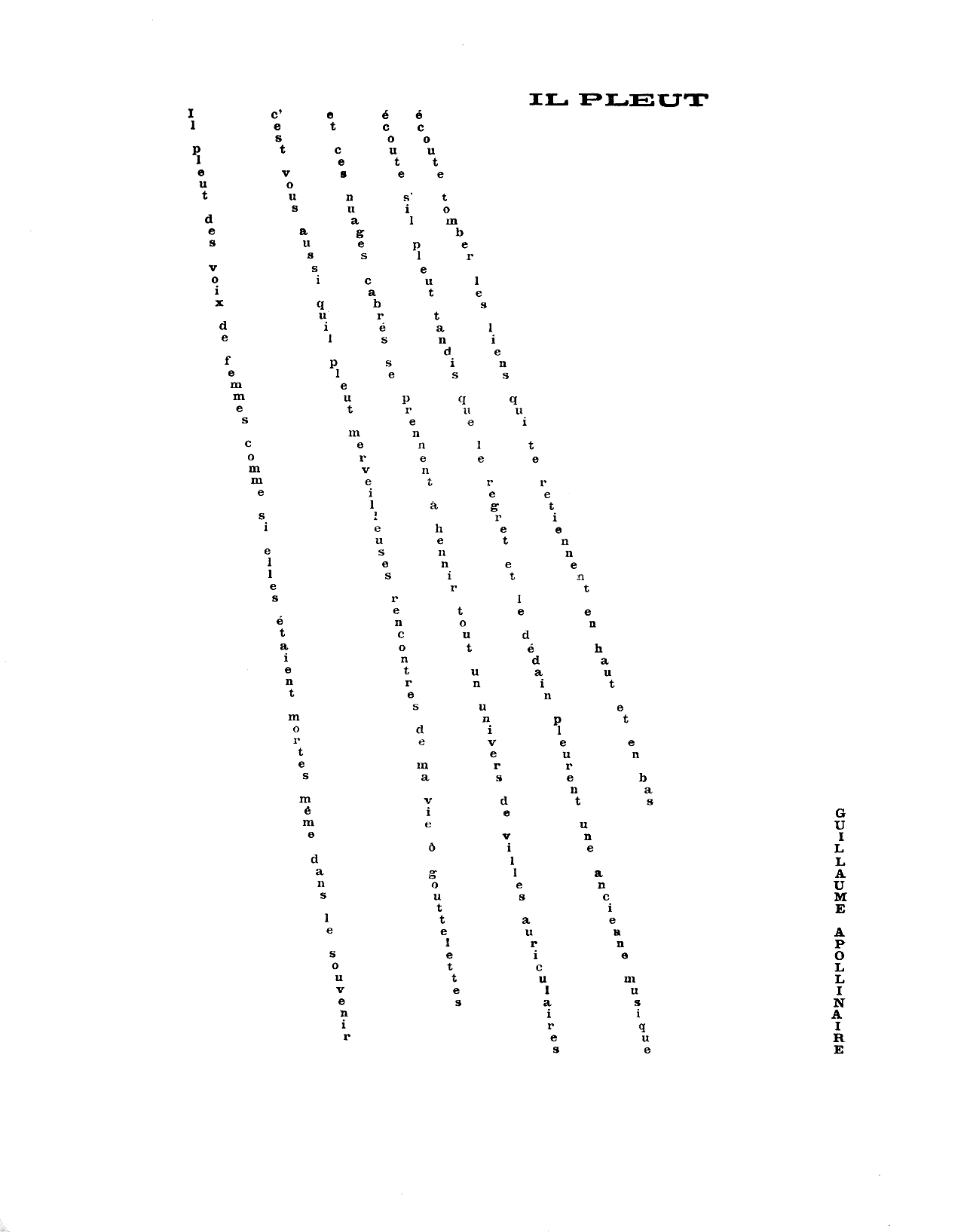
To better understand how form and content are interrelated, one can look at authors that cross the boundaries between writing and design. For most written publications, there is a division of labour between the author and the designer. Within this division, the designer is understood to be responsible for form and the author for content. For a whole range of modernist poets, however, the design became an integral part of the content. “The Dada and Futurist poets, for example, used typography to create texts whose content was inextricable from the concrete layout of specific letterforms on a page.” Among the works exploring the relation in the most literal way are Apollinaire’s Calligrammes, where the lay-out resembles the subject (the rain, the water fountain, the Eiffel tower.)
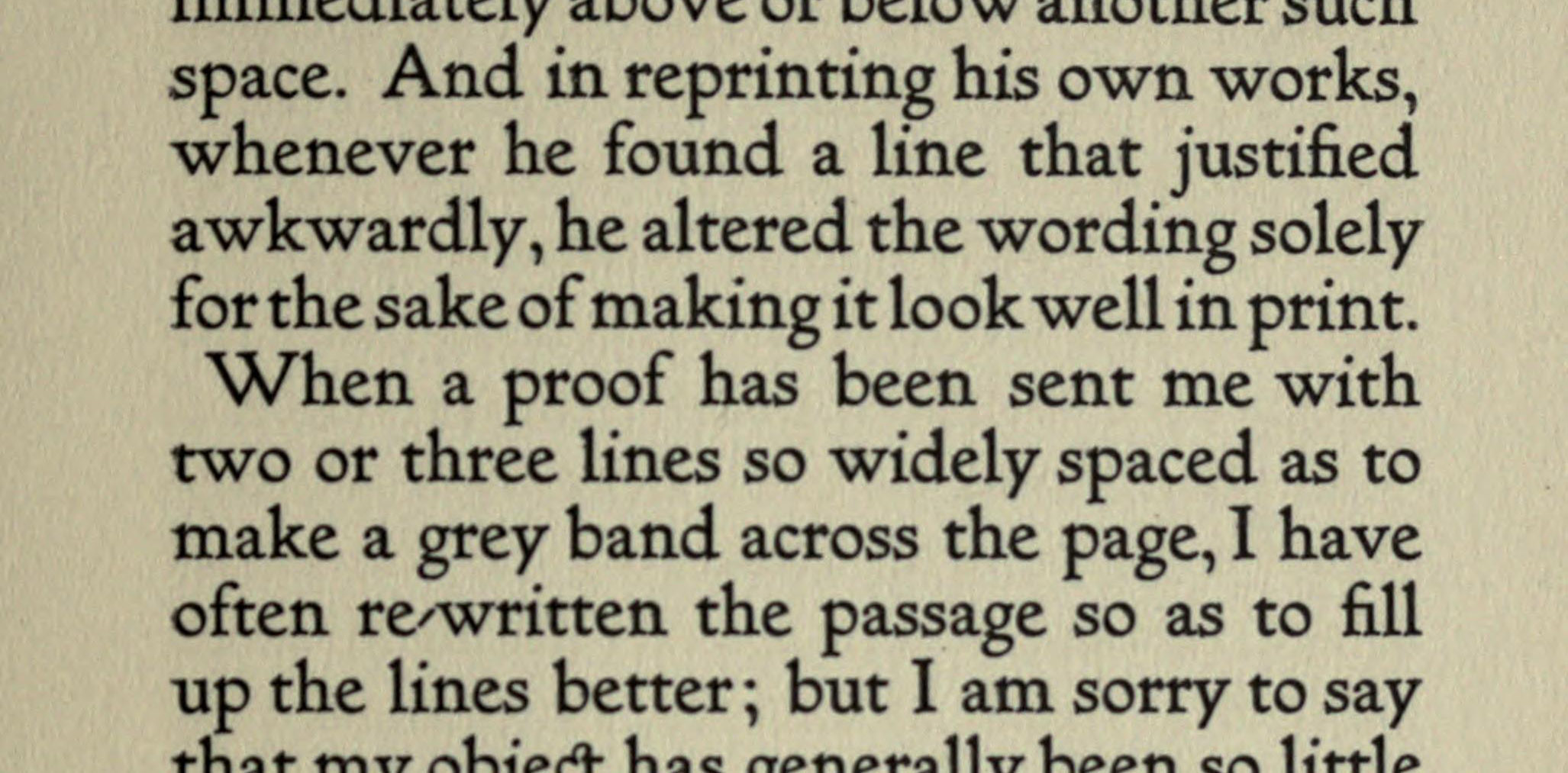
Other authors testify of a more subtle link between form and content, as they let the writing process be influenced by the text’s look on the designed page. Where there is a traditional separation between the author’s manuscript and the designed document, these authors get involved in the process of type setting. In his essay ‘On Modern Typography’ Irish playwright Bernard Shaw admits: “When a proof has been sent me with two or three lines so widely spaced as to make a grey band across the page, I have often rewritten the passage so as to fill up the lines better (…)”. In the same text he also attributes this practice to William Morris, who was even more involved in the typographic production of his later works, typesetting them himself for his Kelmscott press. Desktop Publishing technology has made such an involvement in the industrial process even easier, as the same computer an author uses to write can now also be used to type-set a text. The author Dave Eggers, who is also a designer, editor and publisher, is known to write his books in the lay-out software Quark Xpress directly.
Authors taking up the role of designer make a good case for the interrelation of form and content. Yet also in a process that follows a more traditional division of labour, it is tricky to separate the two. We never read the Word processing file an author sends to their editor. Rather, we encounter its edited and designed form, and we read it in the context of a publication. Editors routinely modify text to correspond to a publications format and to fit space restrictions. Designers then add a layer of intelligence to the publication. Making line-breaks, choosing typefaces, creating hierarchy through typography—all the usual labour of the designer—determines how the text will be read.
The moment we can understand the relation between form and content is when they get separated. In English newspapers, a factual heading is often followed by a more whimsical subheading. When digitising and making accessible these newspapers, the scanning process might not pick up on the difference between the two levels of headings. When both headings have the same importance in the new digital interface, this will make for an awkward reading experience.
The design associated with a text also guides the expectations of the reader. When the American association for graphic designers, AIGA, created their series of design theory readers, ‘Looking closer’, they took their cues from scientific publishing when it came to the design. All articles have the same sober typography. The unified design makes the reader forget the writings come from a variety of publications: fashion magazines like I.D. magazine and 032c, trade magazines like PRINT, but also magazines in which graphic design criticism has a more central place, like Emigre. The end result is that texts that were written to communicate to a mainstream magazine audience feel summary and superficial in the scientific lay-out. If some visual cues from the original publication contexts would have survived, it would be easier to appreciate these texts for what they are.
With time it falls apart: design online
When publishing an article in an online publication, the means to link form and content are similar to those of paper publications. Even if the tools are different, designers still use typography to structure content, and the overall design of the site will construct a context that informs the reading experience. The big difference is that, in most cases, the design will morph and adapt over time, cutting its link with the text.
I got aware this dynamic through a remark of JODI’s Dirk Paesmans. In the early days of the World Wide Web, the website of Wired was done according to the latest trends in web design, much like the paper magazine Wired had a design that evolved from issue to issue. But it would not just be the latest articles that would show the new design. Everything would change. Paesmans told me there was a re-design he liked particularly—but as the inevitable next redesign arrived, there was no way to hold on to it.
Paper magazines have the luxury of being able to evolve from issue to issue, while the older issues will keep their design, forever encoding a specific cultural moment, as testified by the text, the design, even the advertisements. A website drags its mutating past along, continuously redesigning it all.
That the form of a web page is less fixed than that of a printed page might seem obvious. Up to a certain degree web pages are inherently flexible: HTML, a markup language, was designed to give considerable freedom to the interpreting device when it comes to the visual representation. Yet some parts of the way we deal with design online aren’t as much inherent in HTML, they have more to do with the web architectures chosen. These architectures often have an underlying belief in the separation between form and content.
The tendency to separate form and content has its roots in the web’s foundation as a medium for scientists. Science, and by extension scientific publishing, is based on standardising form. Scientific magazines will provide strict templates to follow for authors. Initially, though, the early web technologies did not enforce much separation between form and content. Authors could freely add formatting instructions everywhere in the text.
The first technological development that made a separation feasible is the introduction of CSS (Cascading Style Sheets). CSS allows to store style information apart from the content. For any of the pre-defined tags that HTML offers (heading, paragraph, list item) the style sheet describes how it should be displayed. One style sheet can be used for an entire website, and changing the style sheet once can change the look of all pages. A rag tag coalition of browser vendors, standards bodies and web designer/developers have managed to make adoption of CSS nearly ubiquitous.
A second technological development that has helped to separate form from content online is the advent of Content Management Systems. At first only available to large organisations, powerful systems like WordPress and Joomla have become available for everybody. In these systems, a general design is encoded into a template, and the contents for individual pages are stored in a database that is easily editable by the user. The user does not need to touch the code of the template. For clients this saves time and money. The downside is that a CMS requires shoehorning every page into templates: early HTML pages offered much more freedom in this respect, as potentially every page could be modified and changed to the designer’s whims.
As long as websites keep using centralised CSS files and templates that get modified for each redesign, the links between form and content will keep getting cut online. The goal of this publication is to start imagining alternatives for these web architectures.
Life after the template
In this publication we will find two case studies of workflows that make more intimate links between form and content. The study for the Fotomuseum Winterthur is a proposition. Developed in collaboration with Loraine Furter and the Hybrid Publishing Consortium, it imagines digital publishing strategies that connect with the print production process, and share the encoding of design between print and screen. The second case study, a description of the workflow for creating digital theses at the KABK, has been actually put into practice. Inspired by the process by which amateurs made homepages in the 1990ies, it has allowed graphic design students to create digital publications without the constraint of a template. The digital tool Ethertoff is introduced, which is one of the first collaborative editing system to also allow the collaborative editing of the style of a publication. An interview with Jort de Vries, designer from the Dutch start-up Blendle, introduces the way in which Blendle translates the typographic diversity of print to the screen. Finally, as an appendix, the article ‘Tonight we’re going to publish like it’s 1999’ is a shorter text that reiterates many of the themes in the publication in an accessible format.
Of course, I would welcome your comments.